← Work

Wild Fauna

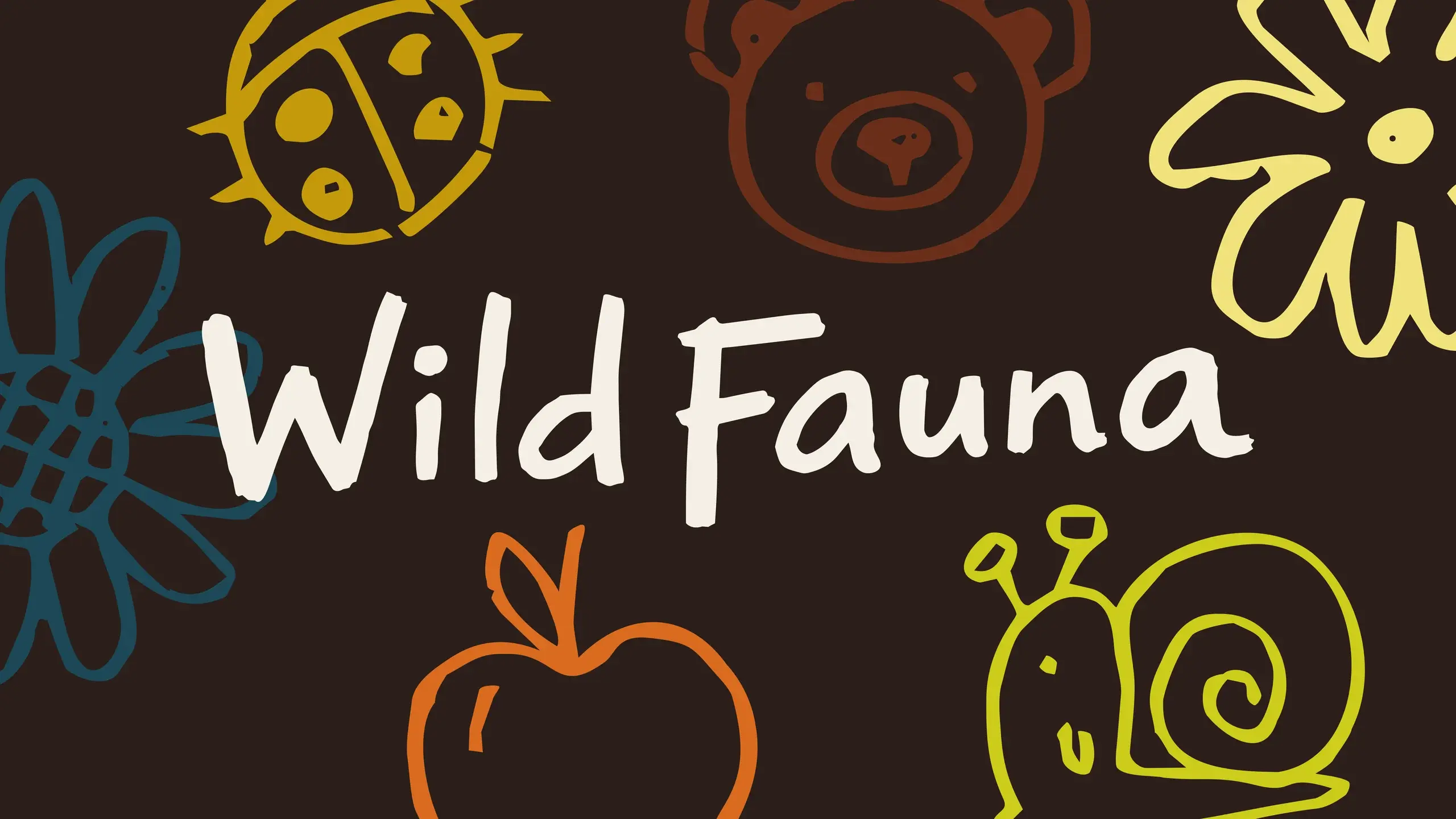
The Wild Fauna wordmark hand-lettered in cream on deep brown, ringed with crayon doodles of flowers, a bear, a ladybird, an apple and a snail.

Wild Fauna is a forest and nature school in Ottawa’s east end that teaches kids through outdoor exploration and play. They came to me for a logo redesign since a full rebrand wasn’t in their budget. I believed in their mission enough to do the full rebrand anyway.

I built a complete brand package: logo, colour palette, typography, doodles and icons, and real examples of the brand in use.

I also helped them define brand pillars, giving them a clear point of view for how they talk about Wild Fauna and a strategy for how they show up in the world, plus ongoing support to help them carry it forward.

The client loved it immediately and started rolling the new logo into their Facebook profile and cover photos right away, with a full announcement planned for the following month. In their words: “It does not feel like enough for the beautiful work you created and how perfectly you captured our vision.” They’ve since asked to stay connected for future work.
ClientWild Fauna
Year2026
RoleFreelance Graphic Designer
ScopeArt direction, brand, strategy
ToolsIllustrator, Photoshop, InDesign, Claude, ChatGPT
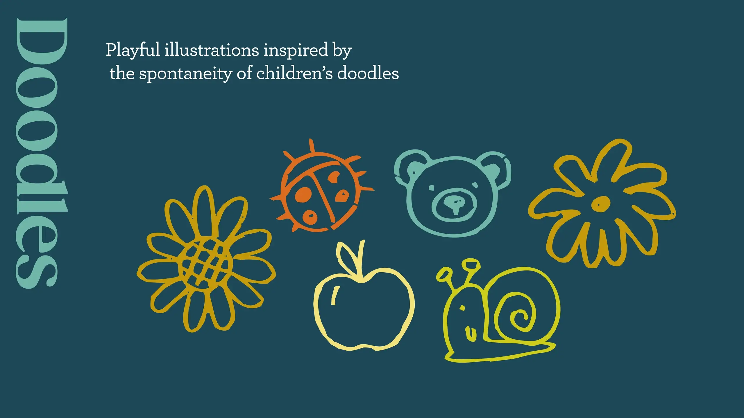
The doodles board: a sunflower, ladybird, bear, apple and snail drawn in loose crayon lines on deep teal, under the note that they were inspired by the spontaneity of children’s drawings.
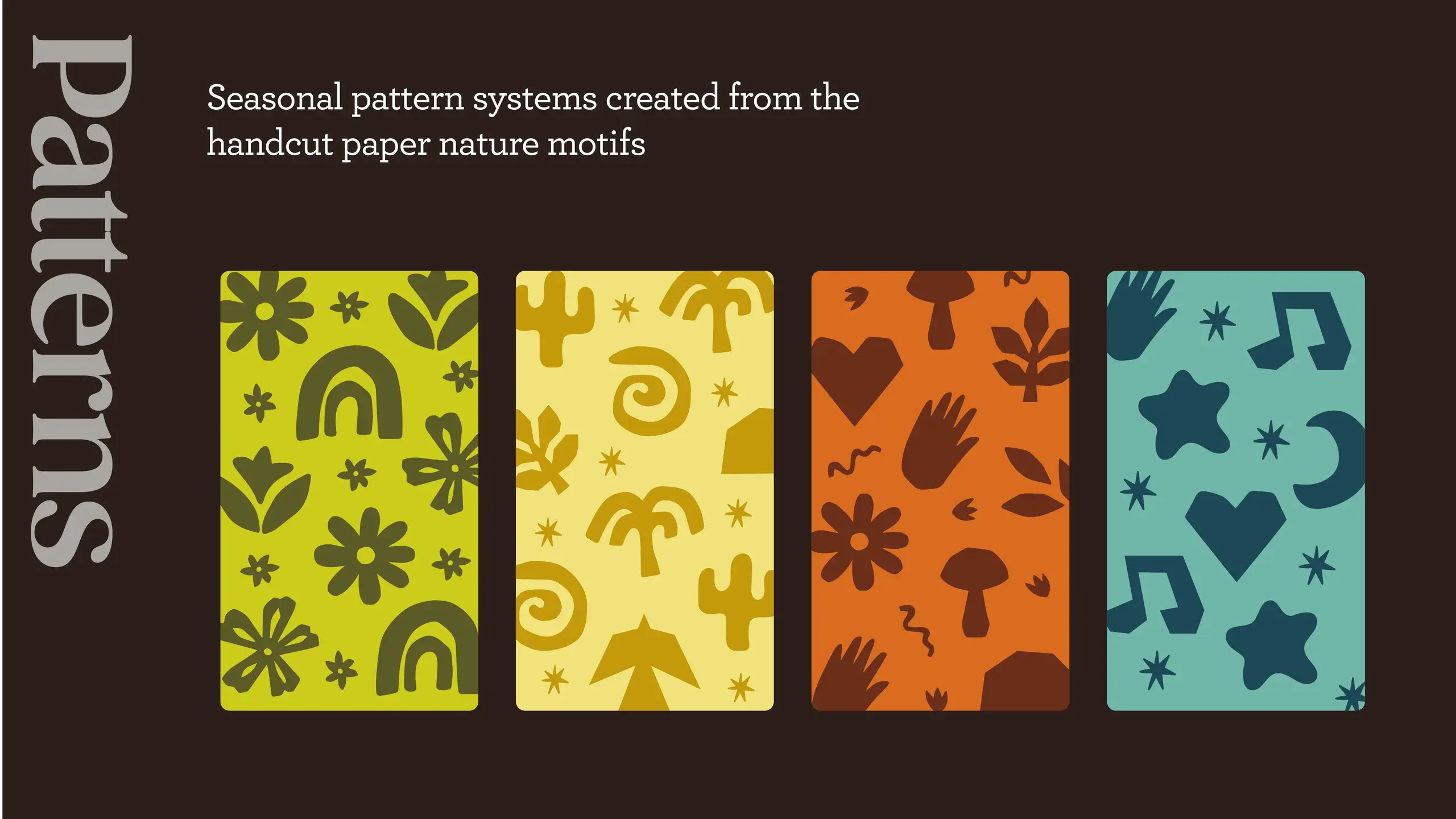
Four seasonal pattern swatches on dark brown — rainbows and flowers, sprouting shoots, mushrooms and hands, and stars and hearts — built from the cut-paper nature motifs.
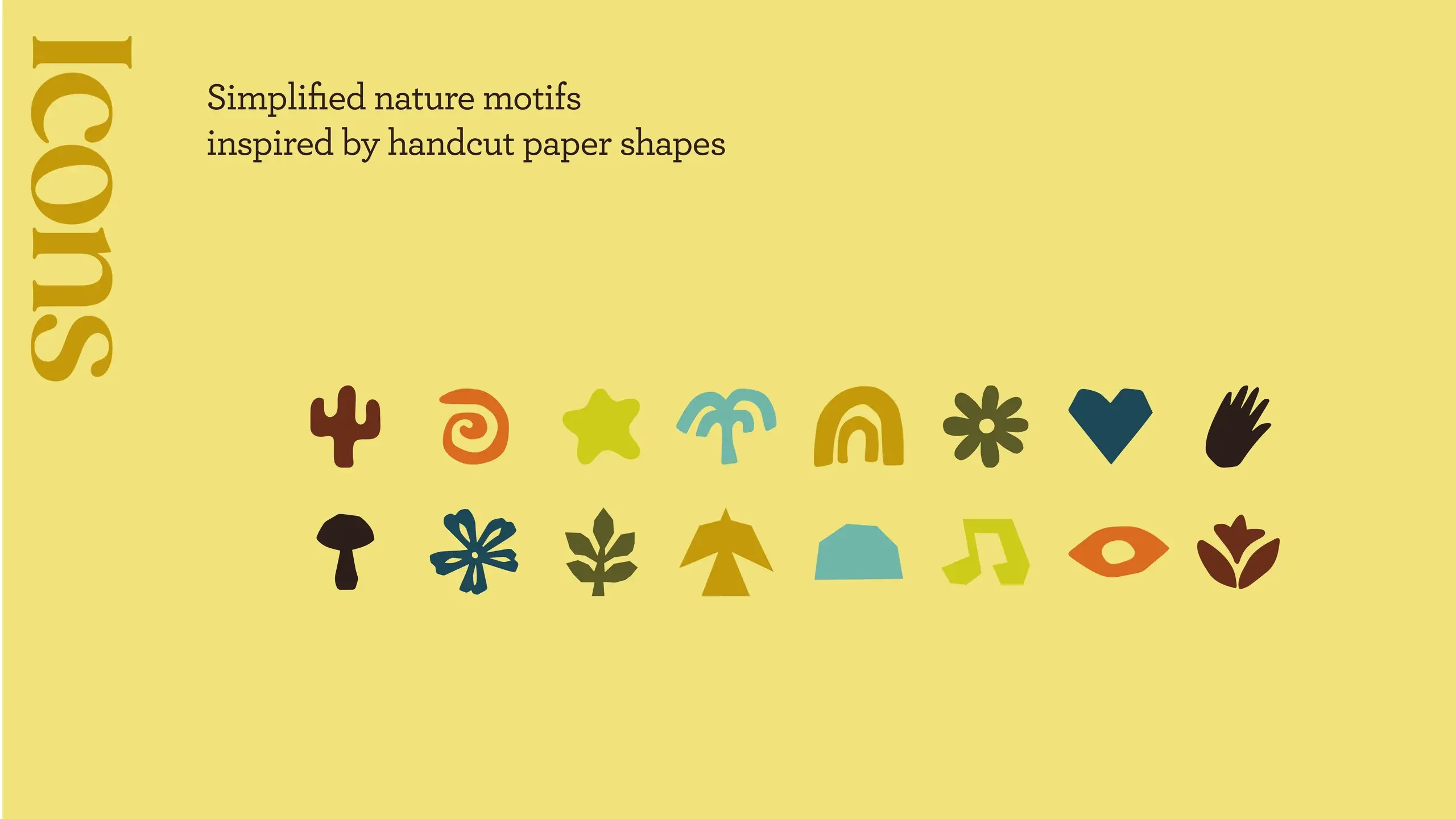
Sixteen simplified nature icons on yellow — cactus, fern, star, palm, rainbow, snowflake, heart, hand, mushroom, flower, leaf, tent, hill, music, eye and tulip — drawn as cut-paper shapes.
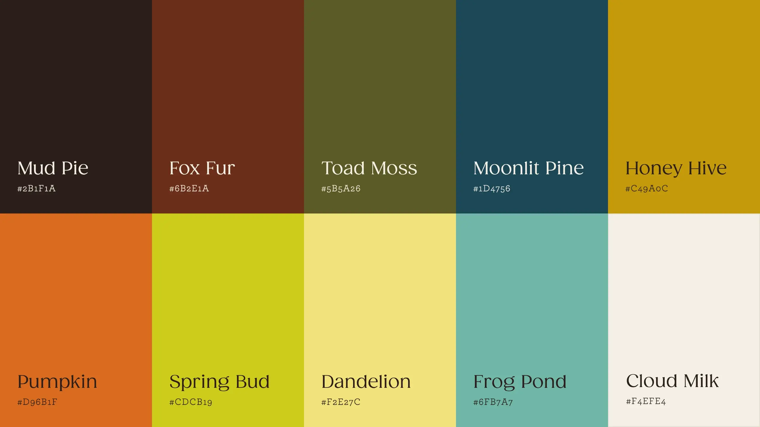
The palette in ten named swatches: Mud Pie, Fox Fur, Toad Moss, Moonlit Pine and Honey Hive above Pumpkin, Spring Bud, Dandelion, Frog Pond and Cloud Milk.
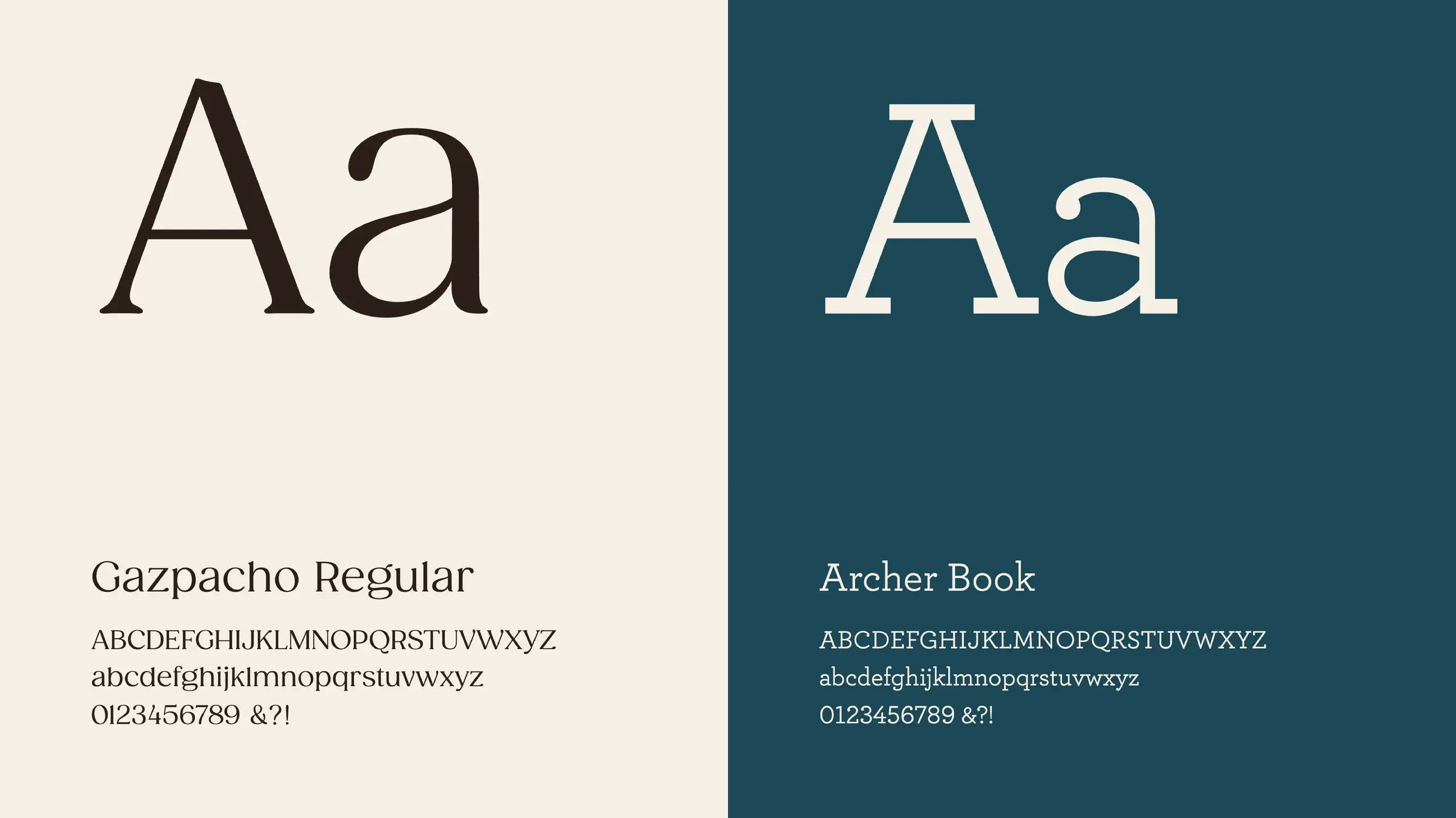
The two typefaces set as specimens: Gazpacho Regular in dark on cream, and Archer Book in cream on deep teal.
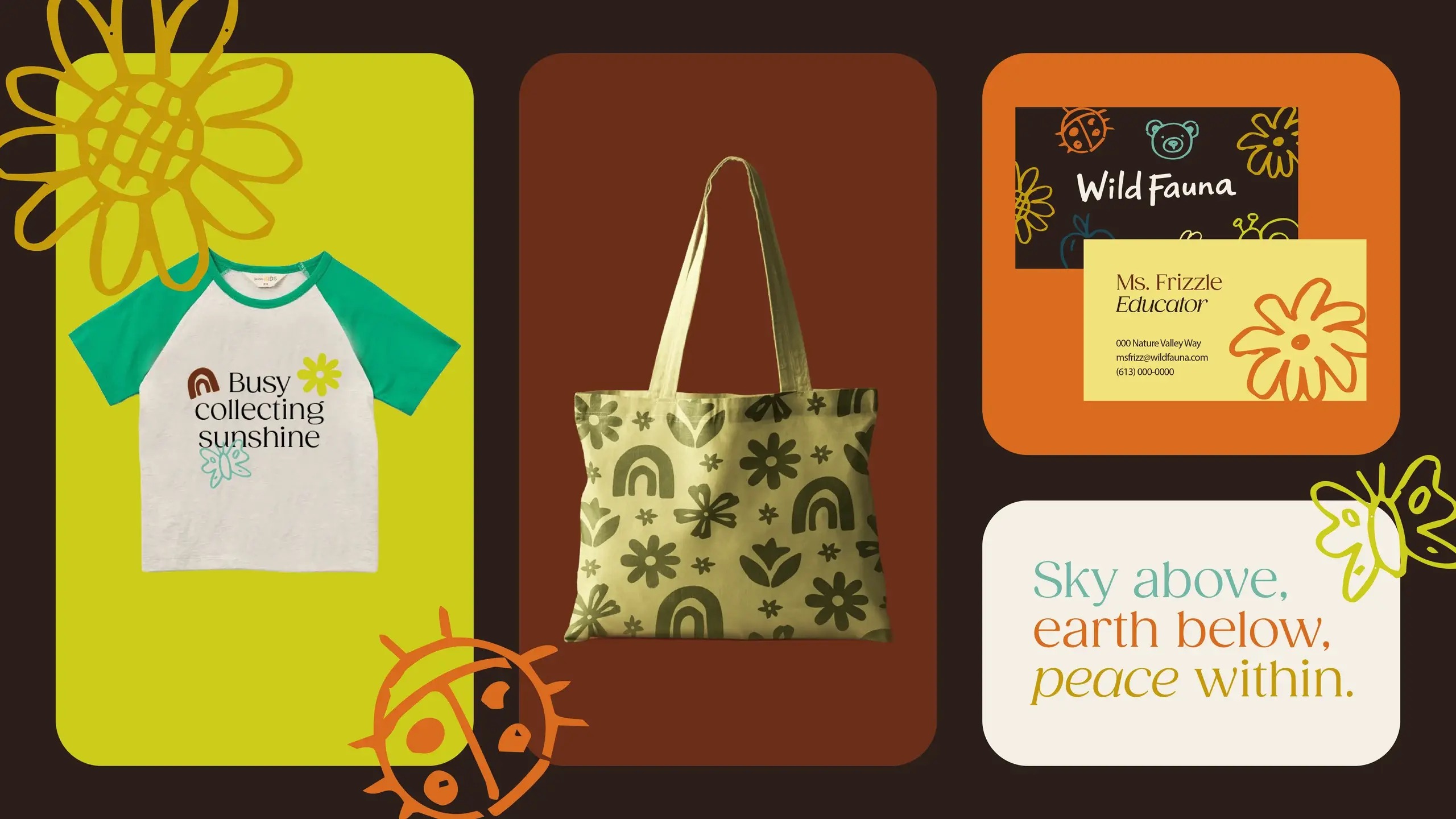
The identity in use: a children’s raglan tee reading “Busy collecting sunshine”, a patterned tote, a business card, and a sign reading “Sky above, earth below, peace within.”
Next projectRückify ESG Report →