Bonds Decor
Bonds Decor is a local, family-owned home decor and paint retailer heading into their 100th anniversary in 2027. Their existing brand felt generic and modern, nothing like a business with a century of history behind it. They brought me in to rebuild it from the ground up ahead of their centennial celebration.
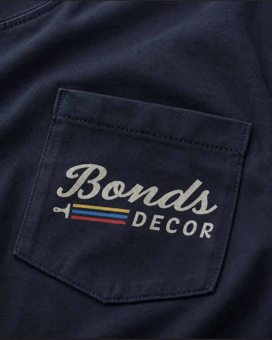
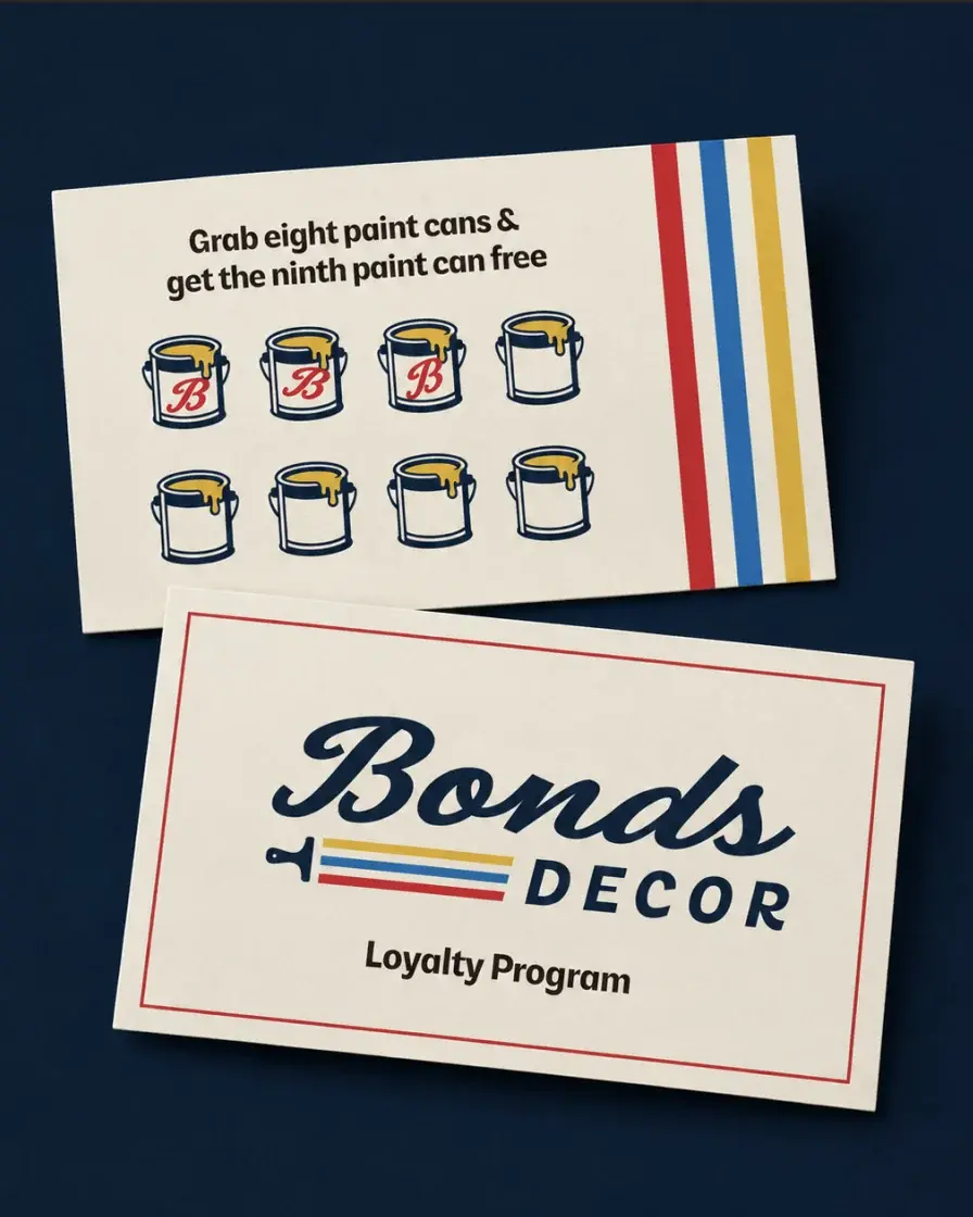
I stripped back the modern look and rebuilt the identity around nostalgia and heritage: a new logo, colour palette, and typography grounded in a warm, vintage-inspired aesthetic. The direction draws on a century of craftsmanship and connection, aiming for something that feels established and enduring rather than trendy.
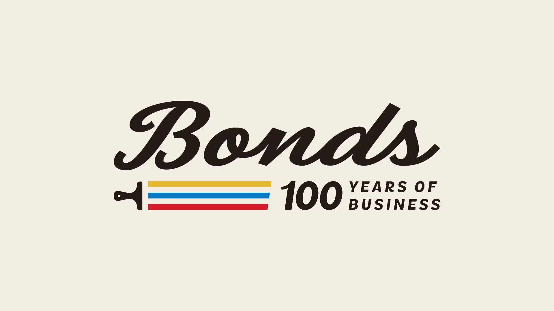
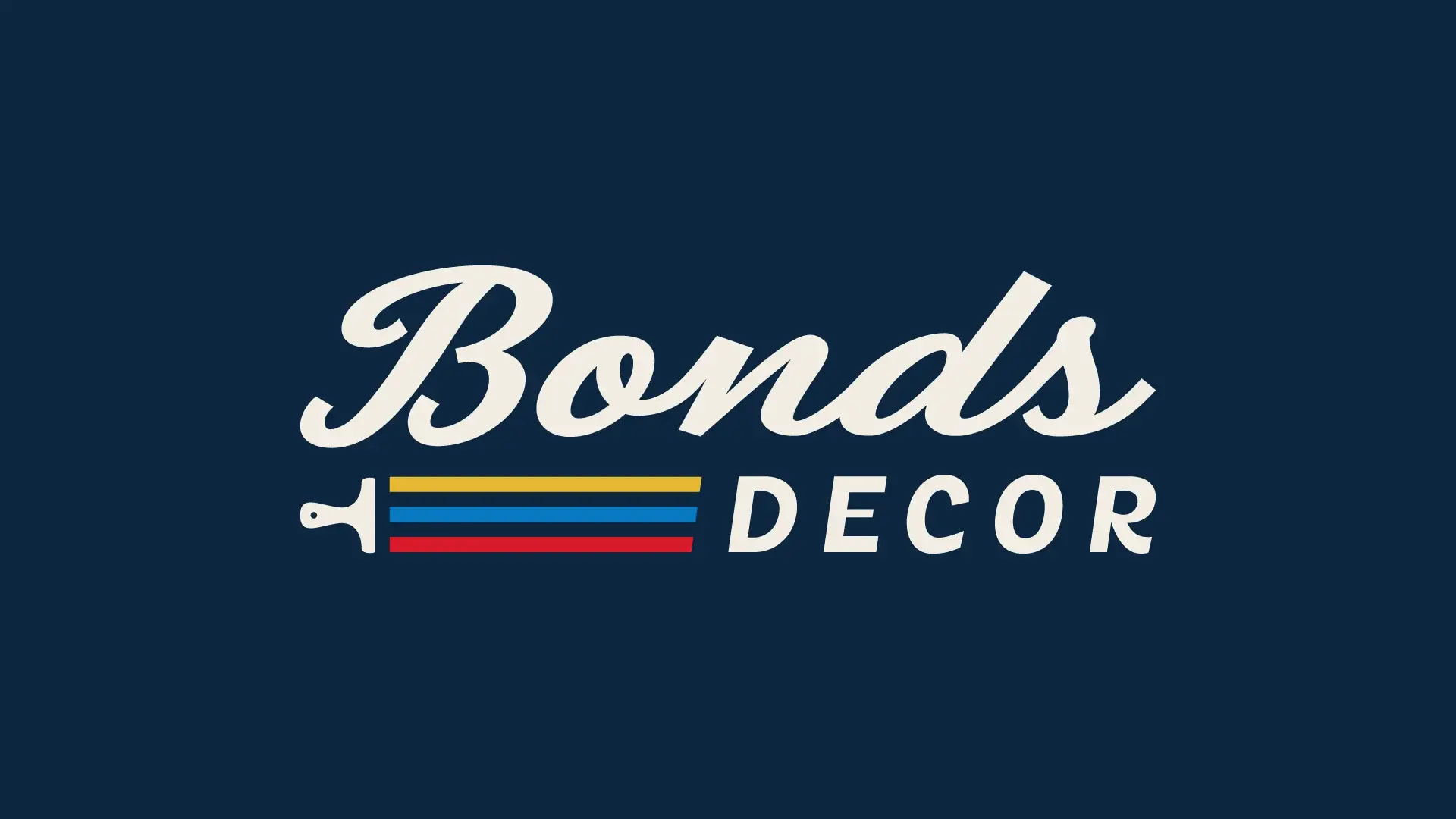
Since paint is their primary product, I built the logo around a paintbrush with three strokes representing red, blue, and yellow, the three primary colours behind every other colour. I also designed a dedicated lockup for their 100th anniversary to show the flexibility of the new mark.
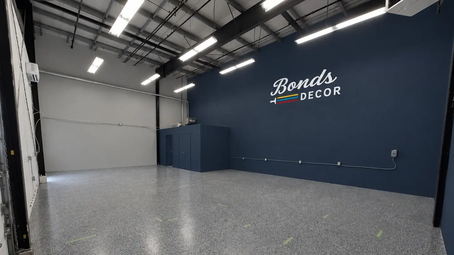
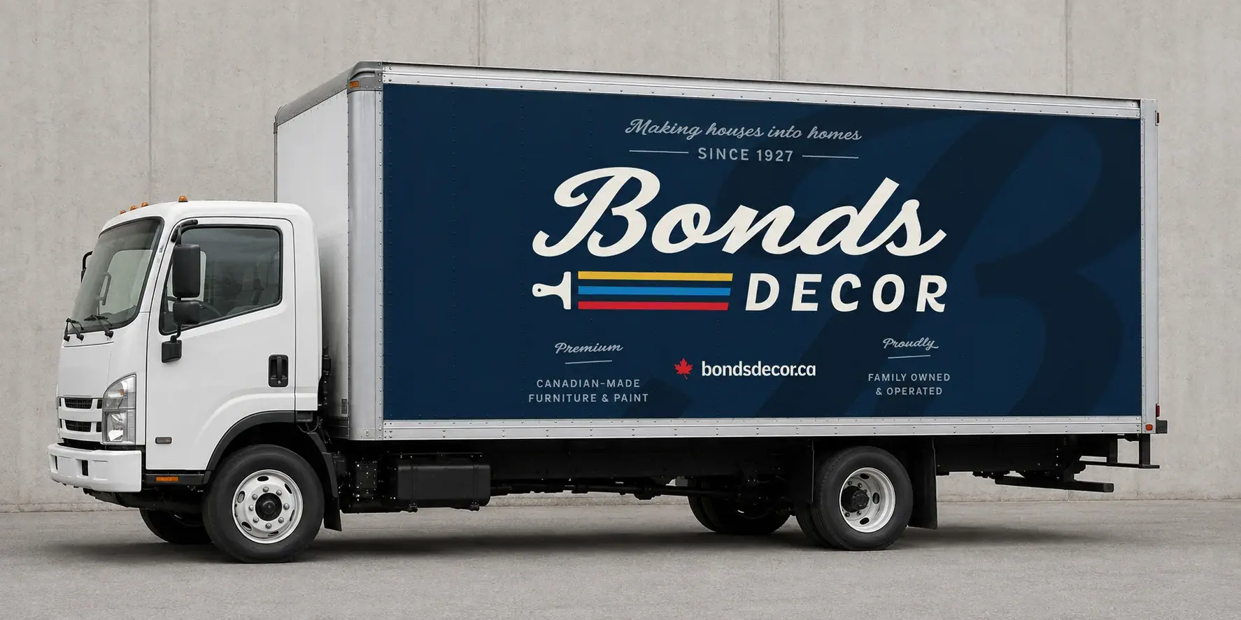
The client loved the direction enough to build the rest of the business around it. The new identity now extends to a store sign, a truck wrap, and the design of their new store opening, all built around the art direction I set. I’m continuing on as an ongoing design consultant for their marketing team, rolling the brand out across their website, ad campaigns, email signatures, and signage.